Department of Energy Redesign
The Problem
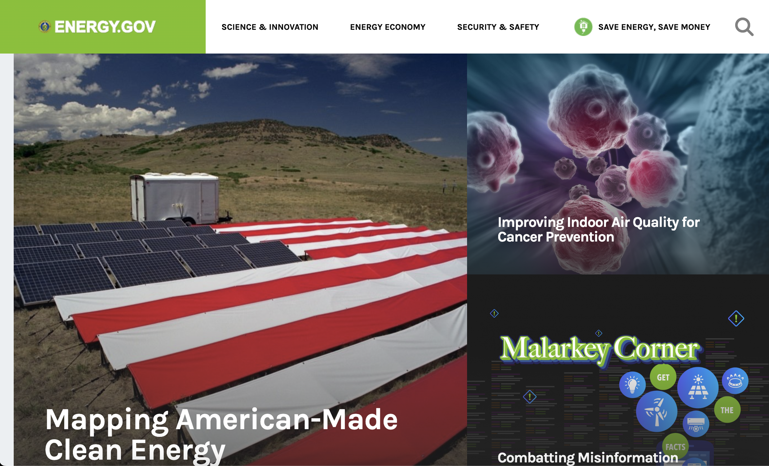
The Department of Energy’s website contains extensive information, which can be overwhelming for users. This amount of content often leads to difficulty in navigating the site and finding relevant information, causing users to become frustrated and lose interest. Consequently, many visitors may abandon the website before discovering the valuable resources it offers, hindering their ability to engage with and benefit from the available information.
Old Website
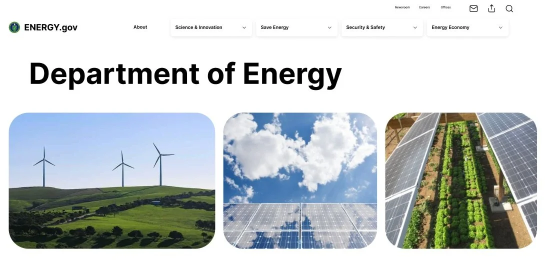
New Website
My research
First, I needed to determine the main issues with the Department of Energy’s website navigation and visual organization. I interviewed several users to understand what they like about the DOE’s website and their main pain points. I took all of our data and organized it into an affinity diagram and then a 2x2 matrix. I also included on here the Usability Testing Plan that I conducted.
User persona
I took all of the data that I collected from my interviews and used it to create a user persona of Randy Johnson. Randy is a 56-year Environmental Policy Analyst working in Riverside, California, and needs easy access to reliable and comprehensive energy data and policies to support his advocacy work.
Wireframes
In redesigning the Department of Energy website, I developed detailed wireframes to establish the foundation for an intuitive and user-friendly interface. The wireframes served as a blueprint, outlining the structure and functionality of each page. Key elements, such as navigation and content placement were carefully planned to ensure a good user experience. By focusing on clarity and accessibility, the wireframes helped guide the visual design and development phases, ensuring the final product aligned with the goals of both the users and stakeholders.


